Contents
Explore ocean models of carbon export
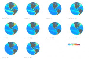
Interactive globe views of all models
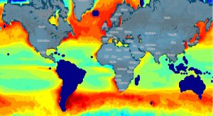
In this visualization, interactive globes present models of oceanic carbon export at present time derived from SeaWIFS data. These are annual means, showing the high productive regions in the northern and southern hemispheres, and also the low production regimes in the gyres.
Scroll to zoom and drag to rotate the globes. The synchronous update allows the comparison of all models over the particular regions selected.
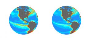
Paired comparison of interactive globes
A one-to-one comparison of the models is shown in this visualization for a more precise analysis. Select individual grid cells to find out the carbon export value in gC/m2/yr.
Select each of the models you want to display. Then, scroll to zoom over the globe, and drag the globe to rotate it. Click on each of the globes to import the coordinates and scale of the other globe once you have zoomed over a particular region.
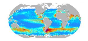
Monthly climatologies
Marine productivity follows a seasonal cycle depicted in this monthly climatology. Carbon export shifts northwards first during the northern hemisphere’s summer, and then balances towards the southern hemisphere at the end of the year.
Select model and month to display the export production of each combination.
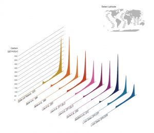
Latitudinal Sections
Despite the similarities on a global scale, model’s estimates are different on a local scale. This visualization allows us to spot these differences at latitudinal sections in each of the major oceanic basins.
Select a latitude section to update the carbon export from west to east for all the models.
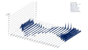
Basin scale
Each of the models have its own signature in terms of magnitude. This visualization explores how models represent carbon export in upwelling regions or high latitudes relative to low productive gyres, giving an overall idea of how individual basins are described.
Select models in each of the major oceanic basins to explore their particular signature.
Google Maps rendition
For the Li and Cassar, 2016, dataproducts, two algorithms were used: Genetic Programming -GP- and Support Vector Regression -SVR-. These products are displayed using the Google Maps engine.
(Work in progress)
The dataproducts displayed here are those from Eppley and Peterson, 1979, Betzer et al., 1994, Baines et al., 1994, Laws et al., 2000, Laws et al., 2011, Dunne et al., 2005, Westberry et al., 2012, and Li and Cassar, 2016.
The comparison analyses were funded by NASA Ocean Biology and Biogeochemistry Research Program, and the data visualization was funded by LabexMER.
The dataviz (except those on Google Maps) have been developed in D3.js by GraphicPrototype.
![]()
![]()


You must be logged in to post a comment.